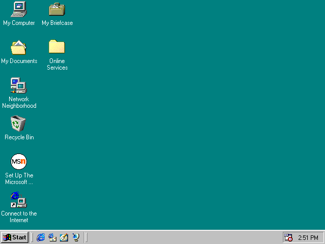
I’ve added new CSS, adding this Windows 1998 windowed look to each post. I’ve always been really drawn to websites that look like desktops. I’ll make a true version of one of those someday.
Yeah, I also always have intense nostalgia for funner times on Web 1.0: flashy Flash websites, gratuitous (sparkly) gifs, cOlOuReD sCroLL BARS, autoplaying midi music, table layouts created by slicing and dicing images in Photoshop, <marquee>, rainbow cursors, image maps and more! I want to bring these things back, but I mean, I also need to consider the reasons why they’re gone in the first place. I’d like to re-purpose these ideas for today’s web!
I’ve had a lot of fun building this site and learning Hugo! I really enjoy writing SCSS. That is to say, if it’s only my CSS and only I have to worry about it and know where things are. I totally get the sadness of the cascade and specificity wars, though.
Things to add or change to this site
- Gratuitous task bar at the bottom of the page with a start menu! And clock.
- Webneko in the colours of Dini and Yuanyuan via web eSheep
- Tree-style archive links in sidebar
- Custom cursor?
- Investigate font rendering options to better preserve crispy pixels. Continuing on my quest to say no to anti-aliasing.
- Change the taskbar window buttons from button elements to spans - as they serve no functional purpose
- Flash of dark mode even if you select light mode
- Mobile layout kind of works, but you have to zoom out
- Dini’s head pop… works, but the Firefox console told me I shouldn’t be using the scroll events that I am
- Host on Neocities? Seems very nice there. I’m not sure how I feel about my random thoughts being open source, even just the build files. HMMM…
- Get a https certificate! Go!
- Maybe an option to remove all this CSS and JS heh heh…